Tuesday, March 27, 2007
Random Scribbles
Just a quick post to put up some stuff that I've accrued over the past few days.
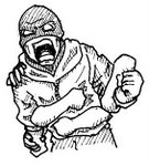
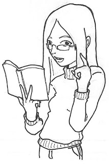
First is something I just had to draw today... one of Bleach's (told ya the characters were kinda easy to draw) poster boys Kuchiki Byakuya. Flash of inspiration of sorts. The second crappier thing is based on a discussion with a friend about women's eyewear and how I don't quite like the huge sunglasses look. Hides too much of the face. Anyway, it looks terrible but it was meant to illustrate a point is all.
Saturday, March 24, 2007
Jealousy!
Wow... seriously. Have you seen the work of professional artists much? How could you NOT be jealous? This time round it's the artist of No Pink Ponies (http://nopinkponies.com/). You can, no, SHOULD check his deviant work via the link from the comic. Insane isn't it? He's even got the attention of Adam F**KING Warren (professional comic artist... has drawn for many series that I love)! How fantastic is THAT? Geez... what does a guy have to do to get to that level, huh?
Anyway the obvious answer is lotsa training and tallent. Lacking that but wanting to flex and grunt as any male should, I set to work to see just how far behind I am. Yup... pretty damn far. Anyway...
What we have here is another attempt at colouring (simplified sketch dramatically) with a new twist in the shadowing. I can't recall what exact method I used but now the shadows aren't all... blackish. I admit this is much more appealing although some regions you just can't see the shadows at all. Anyway, still need to figure out how to blend it in but I think the answer is going to come out as multiple layers of shadowing again. Sigh... still can't do that. I've appended the B&W picture so you can see for yourself what was done to it... roughly. I should start doing backgrounds (as in proper sketches) as well... one day.
The elf girl is just something... I've realised I was losing my ability to draw eyes properly so trying to work around it I came up with a stiff character that I just built the setting around. The last was an attempt at coming up with a comic of sorts. Just thinking how I'd go about drawing a strip showing the horrors of going to the gym (I should start putting in more dialogue as well). Anyway... a bit bland (should have more expression... maybe a heart or something at the girls) and just couldn't convey the horrors of a male locker scenario (for a male... obviously it's not that bad for a female). Why, oh, WHY can't they keep themselves to themselves? Ugh. Side note: panels are totally skewed. I need to use my drawing board to draw proper ones next time.
Thursday, March 22, 2007
Poor quality
Once more I am hit by the need to come up with something new so I just wanted to draw up this new character design. That's the three images of this unnamed person with huge sideburns apparently.
Anyway I was trying deperately to get the pose and stylings of Ulqiorra. The eyes, not so bad... the perpetually sad look is cool but I just couldn't get the style right. The hair just seems wrong and I'm still mixed about those dang sideburns. Anyway... the suit's okay.
Last pic is also a continuation of something I'm experimenting with, i.e. mixing pencils with inks (it didn't work out a while back because I was scanning as Black and White instead of Grayscale) while using a blue pencil to do the preliminary outline. I've also tried using a green highlighter to colour a few parts but I've learned something: poor quality highlighter gives weird looking results.
Friday, March 16, 2007
Further regression
Regression
Man I'm too tired to colour anything so I'm regressing back to pencils as mentioned last post. I'm finding difficulty in even drawing things right with pencils, as you'll notice some pretty weird shaped heads among this bunch.
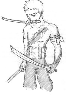
In order, the pics are (1) Roronoa Zoro from One Piece... probably my favourite character; (2) another 'fairy' with hopefully the right costume. I must note that the costume is actually that of a ballet princess kinda thing, e.g. Princess Tutu. It's not a 'fairy' in any traditional sense; (3) Wolf bandits based on some character design I suddenly recalled from someone's sketch in one of the conventions last year. It wasn't exactly matching, as the real sketch is more Sesshomaru-style but I just wanted to get the wolf thingy on the shoulders; (4) Dr McNinja. Okay at this point I realised I was losing it and promptly stopped.
Nothing exciting but something to put up anyway.
Saturday, March 10, 2007
Belated Birthday Greetings
Happy belated birthday, sis! Sorry the online dedication took so long but colouring your picture while experimenting on 'light' sides turned out to be more than I could reasonably handle. That and it's been a tiring week and I had a huge drinking session yesterday night (3 'shots' of alcohol including Vodka and Tequila). Anyway be happy with your picture dedicated to the untold amounts of wealth you will soon garner and the fact that you're one of the first to be coloured at all. Ignore the crappy shading and lighting because I can't afford anything better than a cheap mouse (See the zig-zags on the shadows? That's an unsteady hand at work).
Aaaanyway, that's probably the last coloured pic I'll be working on in a while. They tend to drain a lot of time and effort from me and generally don't tend to look very nice. Well... maybe I can put a few more out but definitely nothing ambitious.
Well, I've done an okay sketch of a gothic lolita coat+corset combination (Pic 1) that a friend brought to my attention. Tres cute, one would have to say but apparently I've been so out of practice that I kinda screwed it up. I need to find a green marker so I can get better shading (another tip from 'Blue Zombie').
Pics 2,3 and 4 were meant to be coloured but I lost the impetus fairly shortly. Momentous task, I assure you. If I ever get the mood to revisit them I might be tempted to add some colour but I wouldn't hold my breath. Pic 2 is (yet another) pretty girl spotted on the trams last weekend sporting one of those bizzare 'I <3 whateva' shirts. Cute, but hard to appreciate in a crowded tram carrying groceries. Pic 3 is of a character called Rouge from the series "Powerstone" ages ago. Sometime during the week I was reminded of that anime and the charmingly proportioned madamoiselle so I thought... fairly easy to colour... why not try lighting with her? Didn't get that far, obviously. Pic 4 is your (you guessed it) Sakura from the mind-blowing-after-a-year-of-crap-fillers Naruto series (props to my pal who first introduced me to it) in her new regalia and slightly matured form. Mmm.... if it wasn't for her deformed right hand I'd probably try to colour her. Oh, well... maybe I can redo it. Can't believe I haven't drawn Naruto characters before this.
Anyway, the alcohol is still coursing somewhere inside me so I reckon I'll stop here. Remember, kids! Drink responsibly (and not like me or my other drunken buddies).
Thursday, March 01, 2007
The new era marches on!
Man, oh man. Once you're on the path of discovery, you just can't stop. Even though I'm groggy from lack of sleep, I just HAD to keep testing out this new-fangled technique.
So I put to test two things: Inked vs Sketched. Apparently inked (the girl with the tattoo) produces cleaner lines than sketched, which sort of helps in the colouring process a bit. However, because the inked lines aren't quite as thick, it gets very hard to colour 'within the lines' so to speak. Nevertheless, sketched (the guy) does have a sorta 'rough' look and generally doesn't really suffer too much in terms of quality.
So what else have I been playing with? Following some tips here and there I played with multiple layers, whereby I can afford to be sloppy in colouring certain places if I wanted to, because the next layer will just cover it. I found some advice on creating a 'whitening' layer whereby the entire layer is just filled white and the opaqueness is fiddled with to produce a slightly more human-like tone instead of the ghastly pink I'd have to deal with by default. Really cleans up the rough lines too. Oooh... and backgrounds too! Those little circly things that darken outwards. LOVE those, but will maybe experiment with other styles in the future.
One more new thing... SHADOWS. A new layer which I use to liberally smear black paint all over. Another change in opqueness and VOILA! It's freaking fantastic, although I still find my efforts severely lacking the quality I'd imagined. The girl was my first effort in shading, which turned out rather crap. The guy enjoyed a little more even shadows, therefore looks a bit more presentable.
Overall, pleased that I've learned a new skill. However bummed that I have to use a mouse to colour seeing as I'm TERRIBLE at using a mouse! Bummed that there's no shortcut I could find as of yet, too. Still... balance the two and I'm still pretty happy.
Edit: Word balloons! Wow!
Dawn of a new era
Harken, ye to the dawn of a new era! Yea, let it be known that after many years of mucking around with pencils, coloured pencils, inks and a shonky scanner, I have finally done it. I have taken my first step into colouring.
First of all, the picture may be a little familiar to you all. It is the 'geisha' girl drawn AGES ago. There is a reason why I picked this picture: it was the simplest to colour.
Seriously... I was following the tutorials kindly provided by the artist of the webcomic Blue Zombie (http://entity.comicgen.com/tutorials.html), which, by the way is a good read itself. Yes, so I was following the steps up to the point where I had to create lassos around the regions I wanted coloured. Oh-kaaayyyy... I tried it on a more complex picture and got REALLY frustrated. Then I found this 'Magic Wand' thingy that could select some regions to be coloured. At first I thought that was pretty neat but rapidly realised that it wasn't all that smart and often selected the WRONG region! Here I thought I could bypass all the tedious lassoing around but in the end I had to concede that it was FAR preferable to do that then to tinker with that infernal wand!
So that took hours of frustration. I had to look for a simpler pic and you can't get simpler to colour than this pic. Next, I fumbled my way around the infernal lasso commands and all that layer stuff... WOW! That took at least an hour... but in the end we bear witness to the FIRST ever COLOURED picture on this site.
There you have it. The one and only. And it will stay that way if I have any say in this.
I'm off to sleep. That took WAY too long.
Subscribe to:
Posts (Atom)